
Your donation page is where interest becomes support. Everything else on your website, from program stories to the annual report, leads here. Yet many nonprofits treat it as a form bolted onto the site. This guide covers how to design a donation page that people finish, and how to plan the donor journey before and after the gift so first-time donors come back.
In short: Good donation page design removes friction. Keep one clear message and one form, offer suggested amounts and a monthly option, ask only for required fields, support mobile wallets, and make the confirmation page and receipt part of the experience. Then test and improve one change at a time.
What a donation page must do
A donation page has three jobs. It must confirm the visitor is in the right place, give a reason to give now, and make giving fast and safe. Anything that does not help with those three jobs is a distraction.
The stakes are real. In M+R Benchmarks 2026, which reports 2025 data, 11% of desktop visitors to a nonprofit’s main donation page completed a gift, compared with 8% of mobile visitors. For small nonprofits, mobile conversion was only 4%. Small design choices on this one page can move those numbers.
The donor journey, step by step
The donor journey is the full path from first contact to a second gift. Map it before you design the page:
- Awareness: an email, social post, event or search result introduces the cause.
- Interest: a program page, story or video explains the need and your role.
- Decision: the visitor clicks a clear donate button with a specific label.
- Gift: the donation page and form.
- Confirmation: the thank-you page and email receipt.
- Stewardship: follow-up that shows what the gift made possible.
- Second gift: a well-timed, relevant next ask.
The last three steps matter as much as the form. The Fundraising Effectiveness Project’s Q4 2025 report found that only 18.9% of donors who were new to an organization in 2024 gave again in 2025, compared with 59.3% of repeat donors. Design for the second gift, not only the first.
Donation page layout basics
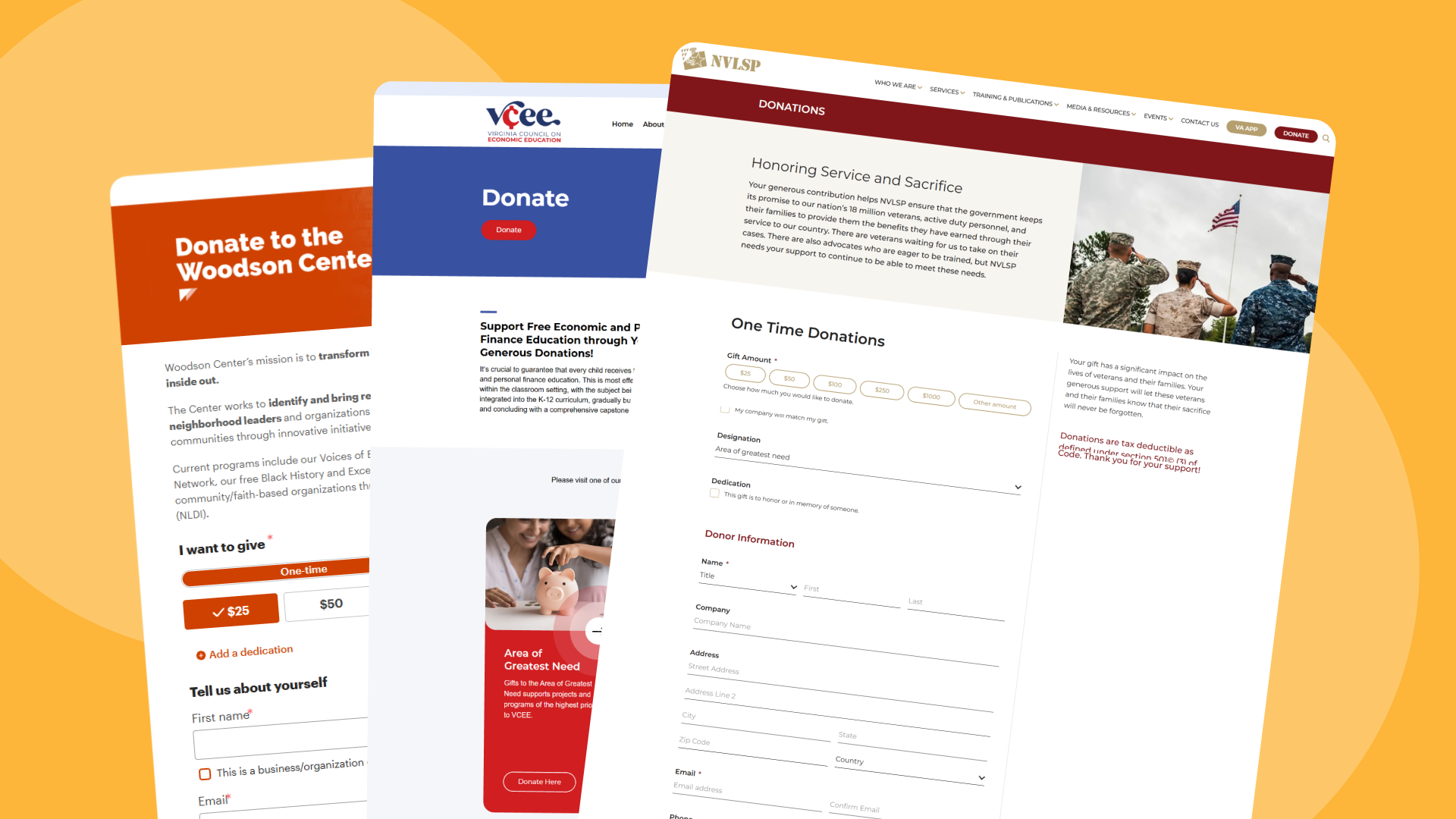
Picture a supporter who has just clicked “Give now” in your year-end email. The page she lands on should confirm in a glance that she is in the right place. Today, most organizations rely on third-party donation engines that use pre-built and lightly customizable donation pages. The landing page prior to the third-party page is just as important as it serves as a validation and landing page describing all available donation options.
Suggested amounts and monthly
Suggested amounts, often called a gift array, help donors decide quickly. Offer three to five amounts plus an “other” field, and base them on your real gift data rather than round guesses. Where you can do it honestly, tie some amounts to tangible outcomes. Show different arrays for one-time and monthly gifts, since a good monthly amount is much smaller than a good one-time amount.
Make monthly giving easy to choose. According to M+R Benchmarks 2026, monthly giving accounted for 27% of all online revenue in 2025. A clear one-time and monthly toggle, with a short line about why monthly support matters, gives donors a simple way to commit for longer.
Design the donation form
Every field you add is a reason to quit. Ask only for what you need to process the gift, send a receipt and thank the donor.
- Required fields: amount, name, email, billing address if your processor needs it, and payment details.
- Optional items stay truly optional: phone, employer match, tribute or dedication, comments.
- One column is best for usability. Placeholder text as the label or above fields.
- Helpful errors shown next to the field, in plain words, without wiping what the donor already typed.
- The right input types, so phones show a number pad for amounts and card numbers.
- An option to cover processing fees, with clear wording.
Multi-step forms can work well on mobile if each step is short and progress is visible. Accessible forms are better forms for everyone. See our guide to nonprofit website accessibility for label, contrast and keyboard requirements.
Payment options and trust
Donors expect familiar ways to pay. In M+R Benchmarks 2026, 79% of nonprofits in the study accepted PayPal on their main donation page, 58% accepted Google Pay, 57% accepted Apple Pay and 44% accepted Venmo. Digital wallets reduce typing, which matters most on phones.
Trust signals help people finish, but use them lightly. A secure checkout (HTTPS) and a recognizable payment processor reassure without a word of copy. Show your organization’s legal name and tax-exempt status, add a short line on how gifts are used with a link to financials, and give a real contact email or phone number for questions. A first-time donor who wonders “is this really them?” should find the answer without leaving the page.
Mobile donation page design
Mobile users made up 52% of nonprofit website visits in 2025 but only 28% of revenue, according to M+R. The average mobile gift was $88, compared with $168 on desktop. Closing part of that gap starts with design.
Think of someone giving from a phone on a bus, one thumb free and a weak signal. She needs large tap targets for amounts and buttons and a short page that loads fast on a cellular connection. Wallet payments near the top save her from typing a card number, and autofill should fill in her name, email and address. Nothing should cover the form: no pop-ups and no sticky banners. We often see mobile forms that pass a desktop review but fail exactly this kind of real-world test.
After the gift: confirmation
The thank-you page is often an afterthought, yet every donor sees it. Use it well. Thank the donor by name, confirm the amount and say what happens next, including when the receipt will arrive. Then offer one next step, such as sharing the campaign, joining the email list or following a program update. Do not ask for another gift right away. Behind the scenes, send an immediate email receipt with your organization’s details.
For U.S. charities, the IRS explains that donors need a written acknowledgment for any single contribution of $250 or more to claim a deduction, and lists what that acknowledgment must include. Ask your finance team or advisor to confirm your receipt wording.
A short welcome series in the weeks after a first gift, with a thank-you and a story about impact, supports the second gift. A thank-you video from staff or a program participant can make that welcome feel personal.
Test and improve conversion
Track the donation page conversion rate (completed gifts divided by page views), average gift, monthly share and drop-off by device. Then test one change at a time: headline, amounts, default to one-time or monthly, number of fields, image, button label. Run each test long enough to reach a meaningful sample. Small sites may need to test bigger changes because traffic is limited.
Donation page checklist
- One headline, short context and one photo
- Form visible without scrolling on desktop
- Three to five suggested amounts, separate monthly array
- Clear one-time and monthly choice
- Only required fields, single column, visible labels
- Card, PayPal and digital wallets
- No main navigation or competing links
- Fast load on mobile, large tap targets
- Thank-you page with one next step and an instant receipt
- Monthly review of conversion rate by device
Donation Page FAQ
What makes a good nonprofit donation page?
A good donation page has a clear headline about impact, a short form placed near the top, suggested amounts, a simple monthly option, familiar payment methods, few distractions and a thank-you page that tells donors what happens next.
How many fields should a donation form have?
As few as possible. Ask for the amount, name, email, payment details and any billing information your processor requires. Make everything else optional, such as phone number, tribute details and comments.
Should a donation page default to monthly giving?
It depends on your donors. Some organizations see more monthly gifts with a monthly default, while others see fewer completed gifts. Test it. At a minimum, make the monthly option easy to see and choose.
What is a good donation page conversion rate?
M+R Benchmarks 2026 reported that 11% of desktop visitors and 8% of mobile visitors to a nonprofit’s main donation page completed a gift in 2025. Use your own baseline to track progress, since results vary by sector, size and traffic source.
Should we use the donation platform’s hosted page or embed a form?
Either can work. What matters is that the page loads fast, looks like your brand, works well on phones, is accessible and passes data cleanly to your CRM. Test the full flow before you decide.
Your donation platform and fundraising team can handle much of this. A design partner helps when the donation experience spans several systems, needs to match a new brand or must work as part of a full site redesign. For that kind of project, see how LightMix approaches nonprofit website design.